Redesigning the Ulta Mastercard Sign-In
I noticed Refactoring UI being mentioned quite a bit on Linkedin, so I decided to pick up a copy. And I’m glad I did! It’s a truly great resource for designers and developers to quickly upskill their UI design, with pragmatic tips and examples.
A lot of the wisdom from Refactoring UI centers on:
giving content the space it needs
de-emphasizing less important elements
following a logical and consistent sizing hierarchy
I found the type scales and spacing scales especially useful. I even exported those pages as separate PDFs that I keep handy when I’m working.
To practice some of the tips I learned from Refactoring UI, I set out to do a quick redesign of an existing site.
I chose a site I see fairly often, as a user of the product…
A sample from Refactoring UI, illustrating ways to improve the typography on this card’s design.
Choosing Ulta to Redesign
If you’re US based, you’ve probably heard of Ulta, the national beauty store chain. I happen to have my very own Ulta Rewards Mastercard (I don’t identify as a makeup addict, but it’s nice to earn points on every purchase!)
I manage payments on my card through their online portal.
That’s how I first noticed that sign in experience could benefit from a few of the tips from Refactoring UI and a dash of my own UX/UI know-how.
Follow along as I go step-by-step through the process and improve the UI (and a bit of the user flow!)
(Please note: This project is not affiliated with Ulta, Mastercard, Bread Financial or any other entities. This is an unpaid personal project.)
Step 1: Select Your Card
The process of logging in starts on this page, with the screen below.
Before
There are actually two credit cards available to Ulta fans: the Mastercard version, and… not Mastercard. On this screen, users self-identify which card holder they are, and click through to that card’s specific log in experience.
This screen is fine overall, but there is a subtle issue that I’ll highlight as we get further in.
After
Using the design principles from Refactoring UI, I made some subtle changes.
I made the screen easier to scan with adjustments to font sizes, line heights, and spacing.
To draw attention a little better to the card selection, I increased the drop shadows on the containers to elevate them higher off the page.
The key part is also the most noticeable: I changed the primary button color. We’ll come back to why.
Before | Select Your Card
After | Select Your Card
Step 2: Sign in
Next, the user inputs their sign in credentials.
I know this blog is called “sign in redesign,” but ironically I wasn’t so concerned with the design of this page. It’s the pages that come after that drew my attention. All I did on this screen was change the primary button color again, and you’re about to learn why.
Before | Sign in
After | Sign in
Step 3: Request 2FA
Here’s where things get interesting! At first glance, it’s safe to say the screen below looks cluttered.
Before
Here’s a few issues with the screen below:
There is redundancy across the copy. You can find three instances of “confirm your identity.”
The two page headings compete. The user is called to Confirm Your Identity, but also to Request a Unique ID Code.
Much of the copy is written as if introducing users to the concept of 2FA (two factor authentication) for the first time, and it may be a bit of overkill.
Take special note of the buttons in the screen above, too:
On the previous screens so far, all primary buttons were Black. On this screen, they’re Ulta Pink (my coinage.)
The screen designs are simple enough that this color switch might not be noticeable to users, and it probably doesn’t prevent anyone completing the sign in experience. BUT, there is a missed opportunity to create a more elegant and consistent experience. And that’s important. Why?
Because great user experiences result in stronger customer loyalty and better brand perception.
Graphic from Sanchit Sharma’s Exploring the Importance and Impact of UX and CX: Differentiating Good and Bad Experiences.
UX and CX (customer experience) are intertwined, with strong correlations between the two.
Just see this article by Kim Lai of Kanopi Studio, How Your Website’s UX Impacts Brand Perception, or Brian Vernon’s article, The Impact of UI/UX Design on Brand Perception. Basically, if your digital experiences are designed well, customers think better of your brand, and that has a direct impact on business.
After
So let’s see what happens if I apply some principles from Refactoring UI to this 2FA screen.
You can almost hear the visual noise tuning down. Let’s look at the before vs. after side by side.
Before | Request 2FA
After | Request 2FA
I relied heavily on the concept of de-emphasis while redesigning this screen. The CTA button group is a great example of this. The primary action users would take on this page is choosing their 2FA delivery method (text or email.) Everything else, including the “I already have a code” option and even the help text are secondary actions.
Knowing that, I applied the color branding I established earlier (Ulta Pink for primary, Black for secondary) and adjusted the layout, font colors, sizing, and more to better reflect the hierarchy beneath the interface.
I also fixed a little iconographic mix-up. Somehow, I never noticed that the icon for Send Email is… a car? While that mix-up may not stop a user from completing their task, it’s these fine details that build a bigger image of a brand, and we must pay attention to them.
Step 4: 2FA Confirmation
After users receive their unique code via 2FA, they must enter it to finish confirming their identity.
As a user, I always buzzed quickly through this page, my mind on my task (“I want to hurry up and pay my card.”)
I would sort of zone out, and select “Yes, I received my code” without too much thought.
But upon closer look, this page intrigued me. I realized that you HAVE to make a choice. “YES I received it, or NO I did not.” Without selecting one of those options, the area to actually input the code does not appear.
And what happens if you select No…?
Before | 2FA Confirmation / No selected
Selecting NO reveals a lot of copy which strives to explain why the code might not be delivered yet, and all the ways the user could get help.
I really empathized with the designer here. When I was working on the redesign of the Pro Tapes website back in 2021-22, I struggled with an overwhelming urge to hold the user’s hand (verbally.) I found myself writing a ton, hoping I could accurately explain every thing so users would never be lost. But by overfilling a page with written content, you don’t aid user comprehension: you bog it down.
What happens if we go back to the “Yes” view of this modal and open up the tool tips? We get more of this trying-to-be-super-helpful content. There’s a lot, and it’s not particularly easy to read.
Before | 2FA Confirmation / Yes selected, Tooltips opened
After
Let’s see how I can streamline this step.
Observe that none of the steps or content from the previous experience is missing. But it IS organized better. I removed the unnecessary Yes/No toggle, so users can enter the code they receive without an extra step.
If/when users have trouble getting a code, we openly show them options to troubleshoot the issue. These options all fall into a logical visual hierarchy. “Resend Code” is visually coded as a secondary action, and “Change How Your Code Is Sent” (which lets users switch back to email or text) is coded as a tertiary action.
Before | 2FA Confirmation
After | 2FA Confirmation
I also simplified the tool tip content and gave it a nice pink for branding flair.
Step 5: View Dashboard
After hitting Continue, the user would be all signed-in and done. But there was one more thing I wanted to address in my redesign.
The next screen users see after they successfully sign in is the dashboard. Every time I’ve logged in and my dashboard finishes loading, my eyes lock on to this one thing that makes me panic for a split second, every time.
Can you tell what it is?
I owe HOW MUCH?!
Oh wait… That’s available credit, not what I owe. Phew! While my actual available credit is nowhere near that high, because I use auto-pay and my balance is usually $0, that number under available credit tends to be the first non-$0 figure I see. Logically, I know it’s not what I owe. But my brain still jumps to panicking that I bought something expensive in my sleep.
Also, the actions on this screen seem a bit disorganized. The page could also benefit from having some of Ulta’s branding applied to it, while simultaneously making it easier to visually scan.
So how might we reorganize this page into clear areas of focus?
After
Let’s look at the side by side before I run through what I changed:
Before | Dashboard
After | Dashboard
First, I made the assumption that the main action users come to the dashboard for is checking their balance & paying off their card.
So I chunked the balance, due date and primary action (make a payment) together, making this a one-stop shop for the user looking to pay and get out quick.
I turned the top of the page into an account management zone. I reorganized some previously scattered options together, to show both informative signs (yes, you are Enrolled in Auto Pay already) and user options/actions (change your Auto Pay settings) simultaneously.
I also noticed this “Stay Connected” area beneath the dashboard and thought it would make for a great place to inject some branding flair.
The content is the same, but one makes you feel like you’re on an Ulta website.
Wait. Did Ulta… Update their site?!
Not too long after I published this blog, I received an email asking for my user feedback on the site experience.
I thought it was a funny coincidence, possibly triggered on their end by me clicking on the same few pages over and over again while I worked on this project.
I laughed and brushed it off.
Until the next time I logged in…
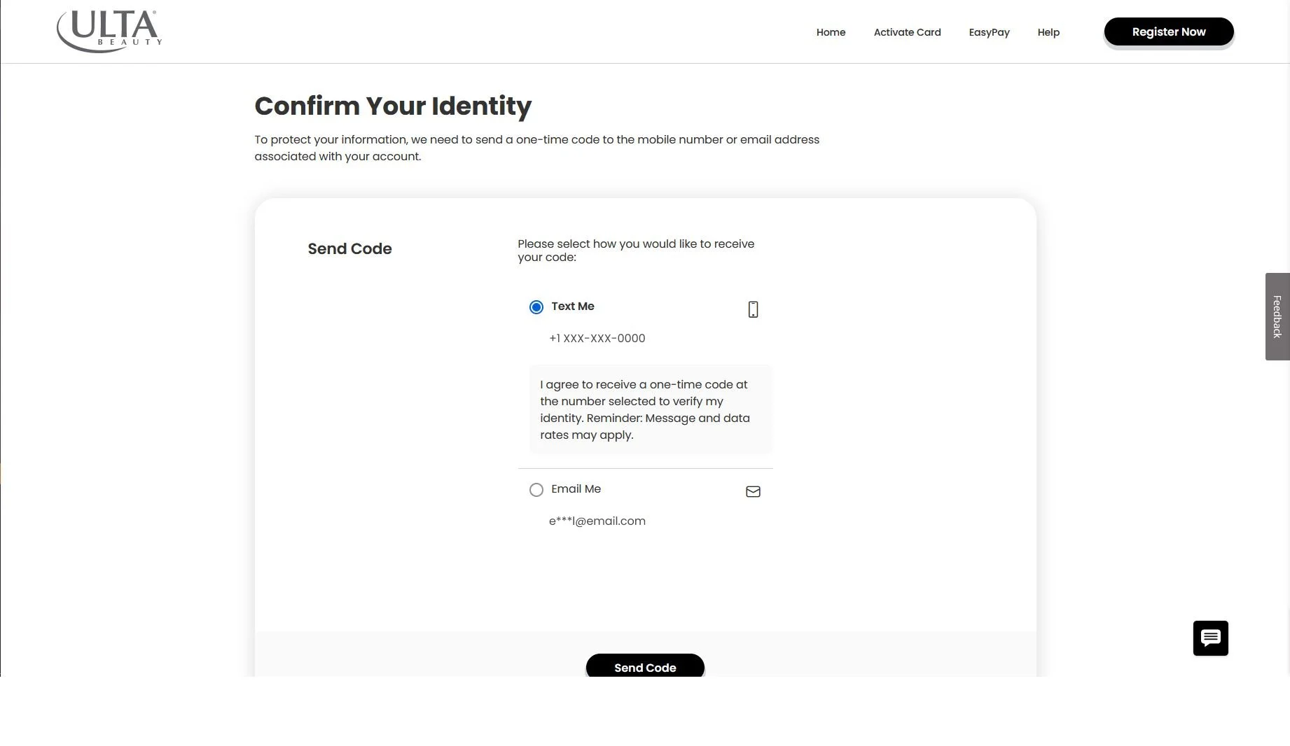
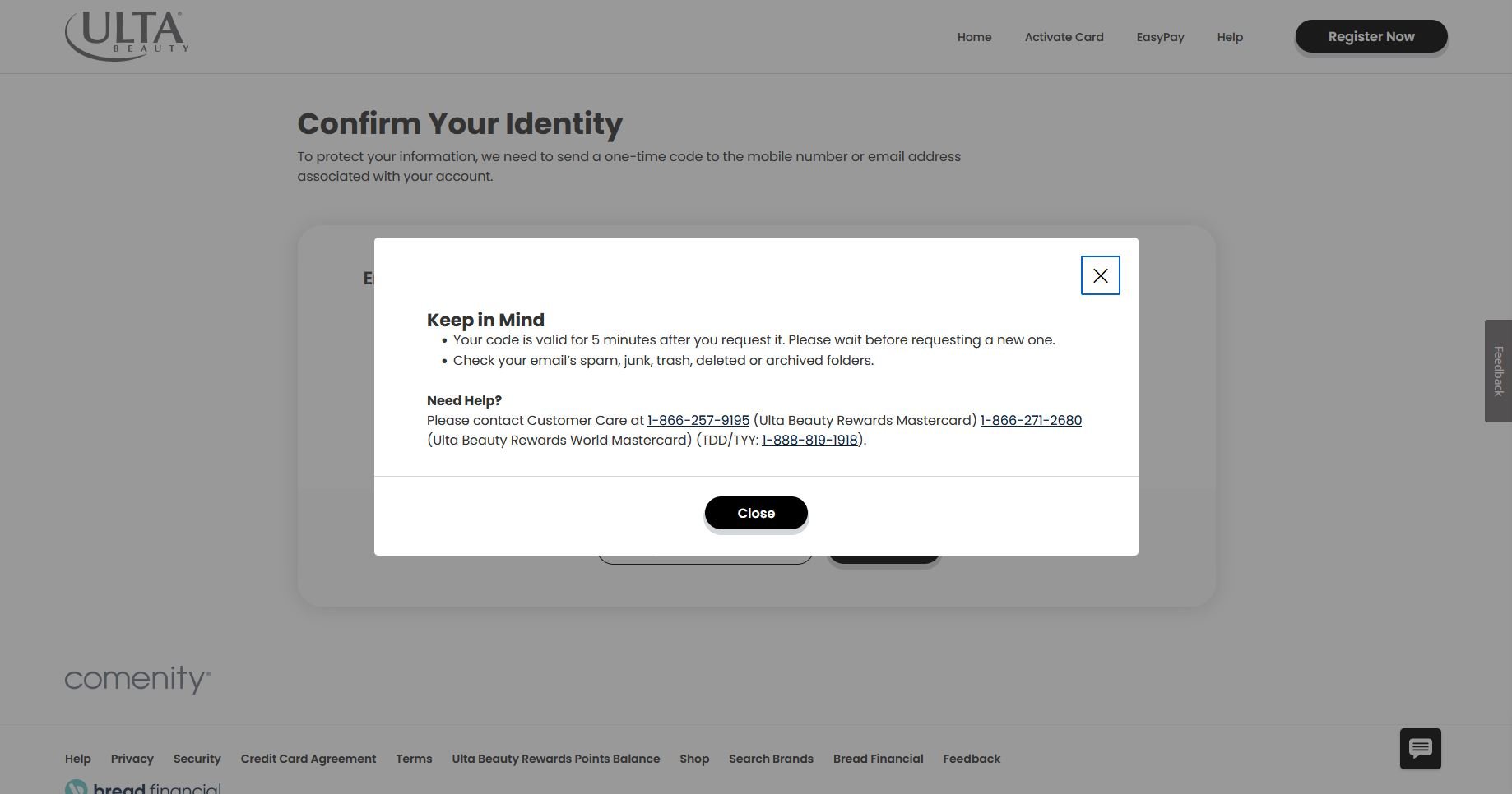
And there was a new experience! Let’s take a quick look.
The sign in credentials page and dashboard page (which I didn’t include in this slideshow) stayed the same from what I can tell. But the actual sign in process is majorly streamlined now!
A little birdie behind the scenes informed me that Ulta is using a white label service for their sign in and card payment experience. Does this mean the service provider changed their UX/UI and pushed it out to all of their customers, including Ulta? Did Ulta ask for changes to their experience specifically? Someone out there knows, but not me…
Regardless, it’s really awesome to see how some of the ideas I made in my redesign match some of the choices in this updated experience. It’s a nice validation of my design problem solving—and a great improvement as a user!


