
Mentor Buddies Onboarding

Details
Role: UX/UI Designer
Context: Design proposal based on a real client, as part of Bitesize UX’s Business Goals for UX Design Feb 2024 cohort. 1 week sprint working in a team of 3 (with Wolfgang Harland and Marti Walker)
Tools: Figma, FigJam
How might we help users confidently choose a mentor, and reduce churn rate?
During the beta launch of a new mentorship community by Design Buddies, they stumbled across a retention problem. More than 66% of users were dropping off without completing the onboarding process or having a chat with a mentor. I took ownership of improving the initial onboarding process to improve user outcomes and reduce churn rate.
Process:
Getting stakeholder insight
I sat down with Grace Ling, the founder of Design Buddies and Mentor Buddies, to find out her thoughts on the Mentor Buddies beta launch.
She told me users reported positive experiences with their mentor chats (when they had them.) They connected well with mentors and had great takeaways.
Despite this, Grace’s team noticed most users never reached the point of having a mentor chat. She suspected something was going wrong during onboarding and asked if we could investigate.

Searching for the friction points
I began by reviewing page metrics in Mix Panel, then conducted interviews with a handful of beta users to learn more about their experiences with each step of the process.
I also diagrammed the current user flow to build deeper familiarity.
I discovered three areas causing the greatest friction:
Prompted to Create a Profile Too Early
Over half (66%) of users dropped off at the profile creation screen. Users wanted to know what Mentor Buddies was all about before committing to sign up.
How might we help users understand how their lives will improve with MB?
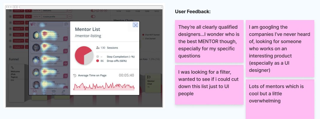
Mentor List Not Tailored To User
Users spent a long time looking at the list of potential mentors, with another 66% dropping off yet again before having a mentor chat. We were not drawing a clear connection between what mentees need and how mentors would provide value.
How might we instill confidence in users that these are the best mentors for them?
Mentor ProfileS Did Not Instill Confidence
The remaining users muddled through and chose a mentor. However, another 81% dropped off while viewing mentor profiles before having a chat. Again, we were not giving users enough information to make a confident choice.
How might we help users understand why this mentor is a top pick for them?
Writing out a better, user-empowering flow
Before diving into any visual design, I scripted out a new flow in FigJam. My goal was to give power back to the user: to make them feel like they are taking an active role in informing us on who they are and what they need at every step.
Wireframing & getting feedback
Because I had written out my flow and UX copy first, it was fairly easy to arrange rough drafts of the screens.
But when I ran into trouble (like where to place the progress bar), I sought out feedback from my teammates.
Designing a complete solution, together
Everyone in our team brought unique perspectives to our standup meetings, which helped us build a well rounded final product. We worked together to ensure the decisions we made working on different areas of the project (onboarding, mentor list, and mentor profiles) were interconnected.
A few highlights from our collaboration:
We observed that finding the right mentor is like finding a great date online. Then I realized we could draw inspiration from a common dating site design pattern: match compatibility.
After users input their choices during onboarding, the match % (along with other design elements, like matched interest callouts) shows users their choices matter. They can be confident this mentor is right for them.
To chat with a mentor, users donate a small amount to a charity of the mentor’s choice. Here, we workshopped how to present the call to action for donating and chatting in the lower half of the mentor’s profile.
I contributed a rewrite of the UX copy, and we iterated on layout ideas as a team until we landed on a design which neatly organizes information about donating & chatting.
Applying branding & content design to the screens
I added branding to my screens and designed new imagery, like the welcome screen splash art. Our research showed users felt anxious about the mentorship process, so I adopted a friendly and encouraging voice for the brand to give the user positive emotional support along their journey.
Welcome Screen
User Goals
How It Works
Create Profile (1)
Create Profile (2)
Create Profile (3)
Verify Your Identity
Sign Up Completed
Stakeholder presentation
We prepared a 20 minute presentation, summarizing our key findings and solutions. I lead art direction on the slides to give our solutions a cohesive, clean look. I also employed a fun little trick I recently learned from Christine Vallaure’s Figma masterclass, and created a live prototype embedded within slide 2.
(Tip: Tap the slide below to view. Navigate with arrow keys.)

Our new onboarding and first time user experience gives back control to the user:
We empower users to tell us what they need, while hooking them in with the value Mentor Buddies provides.
Evaluating our success
To measure whether our new experience improves user adoption & retention, I would:
Compare drop off rates of the old vs. new flow in Mix Panel; are there any reduced or new areas of friction?
Evaluate retention by looking at the % of new users who start their first chat; % of users who start a second chat, etc.
Determine user happiness by sending an email survey to users after their first chat, and/or after a user does not have a chat 5 days after sign up. We want to gather reports of both positive and negative experiences to get a complete picture of what is working and what is not.
We could also ask survey participants if they are open for a follow up interview. We’d gather participants to interview directly to get deeper insights on both positive and negative experiences.