
Pro Tapes Web Redesign

Details
Role: UI Designer
Context: Redesign of B2B company website and digital product catalog
Team: 2 person designer & developer/project manager team under the umbrella of Marketing
Time: Between July 2021 - April 2023 (1 year 10 months), working intermittently while managing other Marketing assignments
Tools: Primarily Adobe XD, later Figma
Artifacts: Wireframes, hi-fi mockups, prototypes, design system
Modernizing Pro Tapes’ website to improve high-value conversions
Pro Tapes is an adhesive tape manufacturer and specialty converter. They produce their own tape products and help other tape companies produce their products. This is called Contract Converting. Contract Converting is the most high-value product/service that Pro Tapes offers. Yet, only 1.3% of overall page views went to the Contract Converting Services pages.
Pro Tapes also had a large, unorganized digital product catalog that was difficult to browse and sort. The site experience was also not mobile-friendly. Mobile users had high drop out rates; not good in a time when users increasingly browse websites on mobile.
Our two person team (a developer/project manager, and myself) aimed to improve conversion rates for the Contract Converting pages, while also modernizing the site by creating a responsive and more accessible experience.

A generalized timeline, conveying the ebb and flow of the project’s progress.
There were several challenges with my first time tackling a large B2B site redesign.
As the sole designer, I needed to balance fine tuning the details while covering a lot of ground over several limited sprints.
To save time and effort, the developer…
Used Wordpress, Bootstrap 4, and some custom plugins to build the site quicker - but this limited some functionality. Some UI elements in the launched site would use “out of the box” designs rather than custom-branded UI.
No budget or time was set aside for user research.
I would work largely as a UI Designer, with required functionality passed down to me. To get a better sense of our target audience’s needs, I needed to analyze our competitor’s sites, and question our stakeholders when possible.
At one point, our team had to put the redesign project on hold for several months to service other pressing business needs. By the time we returned to our project, I had grown as a designer and saw all kinds of visual improvements I wanted to make - but couldn't. Instead, our team prioritized what needed to get done to launch by the new deadline, ranking "must haves" over "nice to haves." We communicated closely with our stakeholders to ensure our goals stayed aligned with business needs.
Starting things right with a Design System

Creating a style guide/design system was one of the first tasks I chose to do (even when I received pushback from our team lead, who was concerned it would eat into the project’s budgeted time.) I knew with a system in place, I could design faster (with reusable components and content blocks) and keep more consistent design decisions.
I leveraged Adobe XD’s style library, and treated the design system as a living document: modifying it, making note design decisions, and preparing annotations for the developer.
Home Page
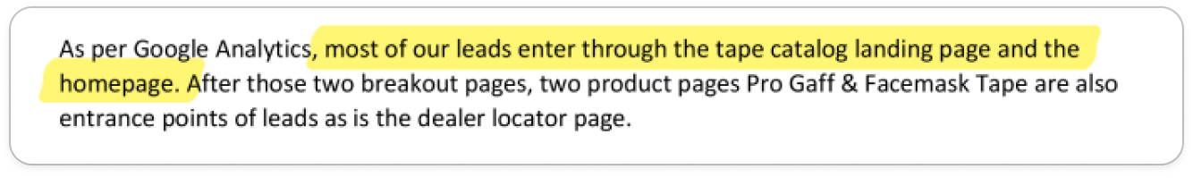
Upon reviewing the site’s analytics, we knew the Home Page was one of the main entry points for our target audience:
We wanted to ensure early on that we had better callouts to key pages (like the Converting Services.)
From a practical standpoint, the Home Page would also feature most of the content blocks that would be reused throughout the rest of the site, making it a great place to begin.

Home Page (Desktop)
BEFORE

AFTER

Product Catalog & Product Pages
(Content To Come: web analysis, before vs. after, web and mobile)

Service Pages
(Content To Come: web analysis, before vs. after, web and mobile)
(virtual tour, individual service pages)

Search Results UX
(Content To Come: web analysis, before vs. after, web and mobile)
How did we Improve Accessibility?
We were able to double our accessibility rating in Google Lighthouse, along with major performance and SEO boosts.
Original Website

New Design

How else might we evaluate the success of our redesign?
Unfortunately, our team did not have the chance to further evaluate our redesign post-launch. However, if I had the opportunity, I would do the following:
Review the site metrics again. What is the visitor rate of our Service Pages now vs. before?
Discover whether the conversion rate/leads for contract converting improved, stayed the same, or declined by interviewing Sales & the Converting Services business managers. Have we noticed an uptick in leads?
Work with business managers to identify and develop the latest KPIs to continue evaluating the website with, producing brief reports to evaluate performance over time as a team.
Once we’ve established a better sense of what is working and what is not, we could design a Version B of specific pages (like the Services pages) and perform A/B testing to see which designs produce more conversions.
What “easy wins” would I go for now?
As mentioned earlier, there are many things I would improve in the user interface given the chance—from better use of white space throughout the site, to font sizing/weight adjustments for better legibility, etc.
But there was one specific bit of actionable feedback that would have improved both desktop and mobile experiences.
When I first shared our redesign on my Linkedin, I received an excellent piece of feedback…
(—More content to come! Stay tuned!)